23 KiB
\mainpage
Introduction
Welcome to the FTXUI documentation!
This is a brief tutorial. You are also encouraged to learn, by reading the examples
@tableofcontents
Short example
To build a single frame, you need create an ftxui::Element, and display it on
a ftxui::Screen.
main.cpp
#include <ftxui/dom/elements.hpp>
#include <ftxui/screen/screen.hpp>
#include <iostream>

int main(void) {
  using namespace ftxui;

  // Define the document
  Element document =
    hbox({
      text("left")   | border,
      text("middle") | border | flex,
      text("right")  | border,
    });

  auto screen = Screen::Create(
    Dimension::Full(),       // Width
    Dimension::Fit(document) // Height
  );
  Render(screen, document);
  screen.Print();

  return EXIT_SUCCESS;
}
output
┌────┐┌─────────────────────────────────────────────────────────────────┐┌─────┐
│left││middle                                                           ││right│
└────┘└─────────────────────────────────────────────────────────────────┘└─────┘
Build
Using CMake
CMakeLists.txt
cmake_minimum_required (VERSION 3.11)

# --- Fetch FTXUI --------------------------------------------------------------
include(FetchContent)

set(FETCHCONTENT_UPDATES_DISCONNECTED TRUE)
FetchContent_Declare(ftxui
  GIT_REPOSITORY https://github.com/ArthurSonzogni/ftxui
  # Important: Specify a GIT_TAG XXXXX here.
)

FetchContent_GetProperties(ftxui)
if(NOT ftxui_POPULATED)
  FetchContent_Populate(ftxui)
  add_subdirectory(${ftxui_SOURCE_DIR} ${ftxui_BINARY_DIR} EXCLUDE_FROM_ALL)
endif()

# ------------------------------------------------------------------------------

project(ftxui-starter
  LANGUAGES CXX
  VERSION 1.0.0
)

add_executable(ftxui-starter src/main.cpp)
target_include_directories(ftxui-starter PRIVATE src)

target_link_libraries(ftxui-starter
  PRIVATE ftxui::screen
  PRIVATE ftxui::dom
  PRIVATE ftxui::component # Not needed for this example.
)
Build
mkdir build && cd build
cmake ..
make
./main
List of modules.
The project is made from into 3 modules:
-
ftxui/screen defines a
ftxui::Screen, this is a grid offtxui::Pixel. -
ftxui/dom is the main module. It defines a hierarchical set of
ftxui::Element. An element draws something on theftxui::Screen. It is responsive to the size of its container. -
ftxui/component The part is only needed if you need to respond to the User input. It defines a set of
ftxui::Component. The use can navigates using the arrow keys and interact with widgets like checkbox/inputbox/... You can make you own components.
screen
It defines a ftxui::Screen. This is a grid of ftxui::Pixel. A Pixel
represent a Unicode character and its associated style (bold, colors, etc...).
The screen can be printed as a string using ftxui::Screen::ToString().
  #include <ftxui/screen/screen.hpp>
  #include <iostream>

  int main(void) {
    using namespace ftxui;
    auto screen = Screen::Create(Dimension::Fixed(32), Dimension::Fixed(10));

    auto& pixel = screen.PixelAt(9,9);
    pixel.character = U'A';
    pixel.bold = true;
    pixel.foreground_color = Color::Blue;

    std::cout << screen.ToString();
    return EXIT_SUCCESS;
  }
dom
This module defines a hierarchical set of ftxui::Element. An element manages
layout and can be responsive to the terminal dimensions.
Example:
// Define the document
Element document = vbox({
  text("The window") | bold | color(Color::Blue),
  gauge(0.5)
  text("The footer")
});

// Add a border, by calling the `ftxui::border` decorator function.
document = border(document);

// Add another border, using the pipe operator.
document = document | border.

// Add another border, using the |= operator.
document |= border
List of elements
They are all defined inside:
#include <ftxui/dom/elements.hpp>
\include ftxui/dom/elements.hpp
text
The most simple widget. It displays a text.
text("I am a piece of text");
I am a piece of text.
vtext
Same as ftxui::text, but vertical.
vtext("HELLO");
H
E
L
L
O
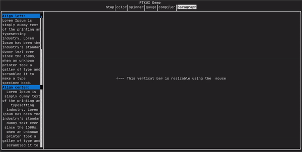
paragraph
paragraph("A very long text")
Similar to ftxui::text, but this support line wrapping and alignments. The
words are split by spaces
See:
Element paragraph(std::string text);
Element paragraphAlignLeft(std::string text);
Element paragraphAlignRight(std::string text);
Element paragraphAlignCenter(std::string text);
Element paragraphAlignJustify(std::string text);
border
Add a border around an element
border(text("The element"))
┌───────────┐
│The element│
└───────────┘
Same, with the pipe operator:
text("The element") | border
Border come with different styles. See:
Element border(Element);
Element borderLight(Element);
Element borderHeavy(Element);
Element borderDouble(Element);
Element borderRounded(Element);
Element borderEmpty(Element);
Decorator borderStyled(BorderStyle);
Decorator borderWith(Pixel);
window
A ftxui::window is a ftxui::border, but with some text on top of the border.
Add a border around an element
window("The window", text("The element"))
┌The window─┐
│The element│
└───────────┘
separator
Display a vertical or horizontal line to visually split the content of a container in two.
border(
  hbox({
    text("Left"),
    separator(),
    text("Right")
  })
)
┌────┬─────┐
│left│right│
└────┴─────┘
Separators come with different styles: See:
Element separator(void);
Element separatorLight();
Element separatorHeavy();
Element separatorDouble();
Element separatorEmpty();
Element separatorStyled(BorderStyle);
Element separator(Pixel);
Element separatorCharacter(std::string);
Element separatorHSelector(float left,
                           float right,
                           Color background,
                           Color foreground);
Element separatorVSelector(float up,
                           float down,
                           Color background,
                           Color foreground);
gauge
A gauge. It can be used to represent a progress bar.
border(gauge(0.5))
┌────────────────────────────────────────────────────────────────────────────┐
│██████████████████████████████████████                                      │
└────────────────────────────────────────────────────────────────────────────┘
A gauge can be displayed into several directions. See:
Element gauge(float ratio);
Element gaugeLeft(float ratio);
Element gaugeRight(float ratio);
Element gaugeUp(float ratio);
Element gaugeDown(float ratio);
Element gaugeDirection(float ratio, GaugeDirection);
graph
@htmlonly
@endhtmlonly
See:
Element graph(GraphFunction);
Colors
A terminal console can usually display colored text and colored background.
Decorator color(Color);
Decorator bgcolor(Color);
FTXUI support every color palette:
Color gallery:
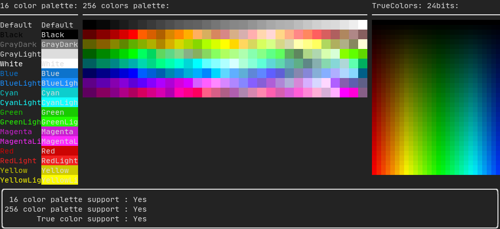
Palette16 #
On most terminal the following colors are supported:
-
Default
-
Black
-
GrayDark
-
GrayLight
-
White
-
Blue
-
BlueLight
-
Cyan
-
CyanLight
-
Green
-
GreenLight
-
Magenta
-
MagentaLight
-
Red
-
RedLight
-
Yellow
-
YellowLight
Example:
text("Blue foreground") | color(Color::Blue);
text("Blue background") | bgcolor(Color::Blue);
text("Black on white") | color(Color::Black) | bgcolor(Color::White);
Palette256 #
On terminal supporting 256 colors. @htmlonly
@endhtmlonly
text("HotPink") | color(Color::HotPink);
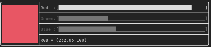
TrueColor
On terminal supporting trueColor, you can directly chose the 24bit RGB color:
There are two constructors:
ftxui::Color::RGB(uint8_t red, uint8_t green, uint8_t blue);
ftxui::Color::HSV(uint8_t hue, uint8_t saturation, uint8_t value);
@htmlonly
@endhtmlonly
Style
A terminal console can usually display colored text and colored background. The text can also have different effects: bold, dim, underlined, inverted, blink.
Element bold(Element);
Element dim(Element);
Element inverted(Element);
Element underlined(Element);
Element blink(Element);
Decorator color(Color);
Decorator bgcolor(Color);
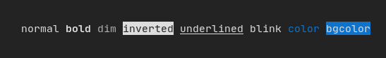
Example:
underlined(bold(text("This text is bold and underlined")))
Tips: The pipe operator can be used to chain Decorator:
text("This text is bold")) | bold | underlined
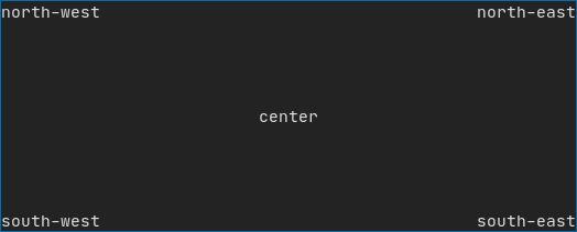
Layout
Element can be arranged together:
- horizontally with
ftxui::hbox - vertically with
ftxui::vbox - inside a grid with
ftxui::gridbox - wrap along one direction using the
ftxui::flexbox.
Example using ftxui::hbox, ftxui::vbox and ftxui::filler.
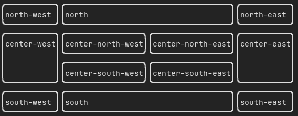
Example using ftxui::gridbox:
Example using flexbox:
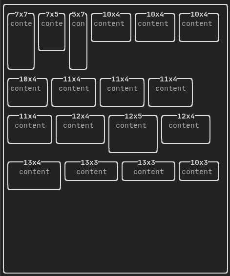
Element can become flexible using the the ftxui::flex decorator.
Examples
  hbox({
    text("left") | border ,
    text("middle") | border | flex,
    text("right") | border,
  });
┌────┐┌─────────────────────────────────────────────────────────────────┐┌─────┐
│left││middle                                                           ││right│
└────┘└─────────────────────────────────────────────────────────────────┘└─────┘
  hbox({
    text("left") | border ,
    text("middle") | border | flex,
    text("right") | border | flex,
  });
┌────┐┌───────────────────────────────────┐┌───────────────────────────────────┐
│left││middle                             ││right                              │
└────┘└───────────────────────────────────┘└───────────────────────────────────┘
Table
A class to easily style a table of data.
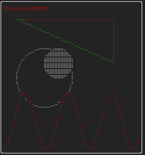
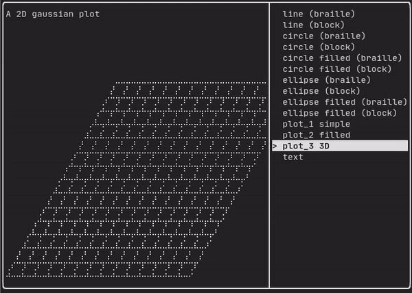
Canvas
  auto c = Canvas(100, 100);
  c.DrawPointLine(10, 10, 80, 10, Color::Red);
  auto element = canvas(c);
Drawing can be made on a ftxui::Canvas, using braille, block, or simple
characters:
Simple example:
Complex examples:
component
The ftxui::componentmodule defines the logic to produce interactive component
responding to user's events (keyboard, mouse, etc...)
A ftxui::ScreenInteractive defines a main loop to render a component.
A ftxui::Component is a shared pointer to a ftxui::ComponentBase. The later
defines
ftxui::ComponentBase::Render(): How to render the interface.ftxui::ComponentBase::OnEvent(): How to react to events.ftxui::ComponentBase::Add(): Give a parent/child relation ship in between two component. This defines a tree a components, which help properly define how keyboard navigation works.
ftxui::Element are used to render a single frame. On the other side
ftxui::Component are used to render dynamic user interface, producing multiple
frame, and updating its state on events.
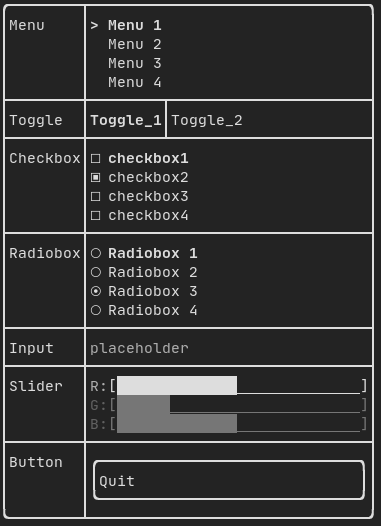
Gallery of multiple components. (demo)
Predefined components are available in "ftxui/dom/component.hpp"
\include ftxui/component/component.hpp
Input
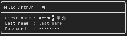
Produced by: ftxui::Input() from "ftxui/component/component.hpp"
@htmlonly
@endhtmlonly
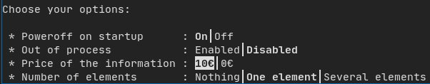
Menu
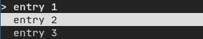
Produced by: ftxui::Menu() from "ftxui/component/component.hpp"
@htmlonly
@endhtmlonly
Toggle
Produced by: ftxui::Toggle() from "ftxui/component/component.hpp"
@htmlonly
@endhtmlonly
CheckBox
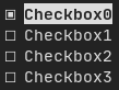
Produced by: ftxui::Checkbox() from "ftxui/component/component.hpp"
@htmlonly
@endhtmlonly
RadioBox
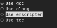
Produced by: ftxui::Radiobox() from "ftxui/component/component.hpp"
@htmlonly
@endhtmlonly
Dropdown

Produced by: ftxui::Dropdown() from "ftxui/component/component.hpp"
Slider
Produced by: ftxui::Slider() from "ftxui/component/component.hpp"
Renderer
Produced by: ftxui::Renderer() from \ref 'ftxui/component/component.hpp'. This
component decorate another one by using a different function to render an
interface.
Example:
auto inner = [...]

auto renderer = Renderer(inner, [&] {
  return inner->Render() | border
});
ftxui::Renderer also support the component decorator pattern:
auto component = [...]
component = component
  | Renderer([] (Element e) { return e | border))
  | Renderer(bold)
As a short hand, you can also compose a component with an element decorator:
auto component = [...]
component = component | border | bold;
CatchEvent
Produced by: ftxui::CatchEvent() from \ref 'ftxui/component/component.hpp'.
This component decorate another one and catch the events before the underlying
component.
Examples:
auto screen = ScreenInteractive::TerminalOutput();
auto renderer = Renderer([] {
  return text("My interface");
});
auto component = CatchEvent(renderer, [&](Event event) {
  if (event == Event::Character('q')) {
    screen.ExitLoopClosure()();
    return true;
  }
  return false;
});
screen.Loop(component);
The ftxui::CatchEvent can also be used as a decorator:
component = component
  | CatchEvent(handler_1)
  | CatchEvent(handler_2)
  | CatchEvent(handler_3)
  ;
Collapsible
Useful for section whose visibility can be toggle on/off by the user.
This is basically, a combinaison of a ftxui::Checkbox and a ftxui::Maybe
components.
auto collabsible = Collapsible("Show more", inner_element);
Maybe
Produced by: ftxui::Maybe() from \ref ftxui/component/component.hpp.
This component decorate another one, by showing/hiding it depending on a boolean
or a predicate.
Example with a boolean:
bool show = true;
auto component = Renderer([]{ return "Hello World!"; });
auto maybe_component = Maybe(component, &show)
Example with a predicate:
auto component = Renderer([]{ return "Hello World!"; });
auto maybe_component = Maybe(component, [&] { return time > 10; })
ftxui::Maybe can be used as a decorator.
component = component
  | Maybe(&a_boolean)
  | Maybe([&] { return time > 10; })
  ;
Container
Horizontal
Produced by: ftxui::Container::Horizontal() from
"ftxui/component/component.hpp". It displays a list of components horizontally
and handle keyboard/mouse navigation.
Vertical
Produced by: ftxui::Container::Vertical() from
"ftxui/component/component.hpp". It displays a list of components vertically
and handles keyboard/mouse navigation.
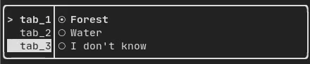
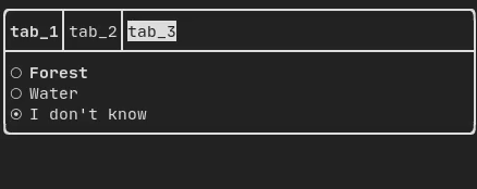
Tab
Produced by: ftxui::Container::Tab() from
"ftxui/component/component.hpp". It take a list of component and display only
one of them. This is useful for implementing a tab bar.
ResizableSplit::{Left, Right, Top, Bottom}
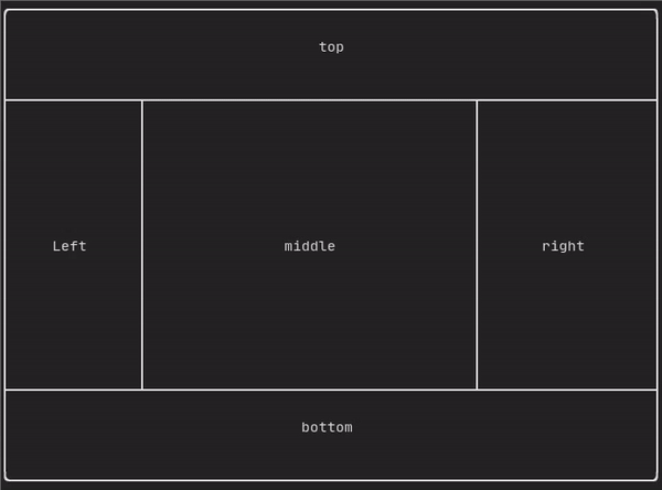
Produced by:
ftxui::ResizableSplitLeft()ftxui::ResizableSplitRight()ftxui::ResizableSplitTop()ftxui::ResizableSplitBottom()from "ftxui/component/component.hpp"
It defines an horizontal or vertical separation in between two children component. The position of the split is variable and controllable using the mouse.
@htmlonly
@endhtmlonly
Force a frame redraw.
Whenever a new group of events have been processed: keyboard, mouse, window
resize, etc..., the ftxui::ScreenInteractive::Loop() is responsible for
drawing a new frame.
You might want to react to arbitrary events that are unknown to FTXUI. This can
be achieve by posting events via ftxui::ScreenInteractive::PostEvent, via a
thread. You can post the eventftxui::Event::Custom.
screen->PostEvent(Event::Custom);
ftxui::ScreenInteractive::PostEvent is thread safe.